


That's Gneiss! #176 ~ Accuracy matters!
Plus: Jamaican curry, and a blue turnip
Hello!
We had our first 60+ degree day yesterday, and it was wonderful to get outside and clean up a corner of the yard. The rain is back today, but we’re definitely on the upswing towards Spring proper. Yay!
Today I’m going to talk about accuracy and attention to detail when selling a product. You may recall a couple of weeks ago I shared the tale of the photoshopped iceberg and pulled in a couple of examples of completely wrong information circulation as “amazing” facts. The internet is rampant with misinformation - we all know that, and sometimes get caught even when we think we’re savvy information consumers. That’s okay! It happens, and we can learn from our errors.
The specific product example I’m sharing today is the Park Color Project from One-Per-Week and GreyStoneArts, a monthly watercolor subscription that features one of the national parks in the U.S. or Canada. I was really excited about the concept - each month you get two handmade watercolors inspired by the park, a fact card, a postcard to paint, and a sticker. I signed up, and have received five of the six shipments.
I really wanted to like these. But each month my uneasiness and annoyance grew, and I won’t be renewing for the next set.
Here are the paints that have come so far, and a few of the stickers. I like the stickers! And I do like the quality of the paints - they were my first foray into handmade watercolors. They have clove oil in them and sometimes my craft room smells like cloves after I’ve been using them.
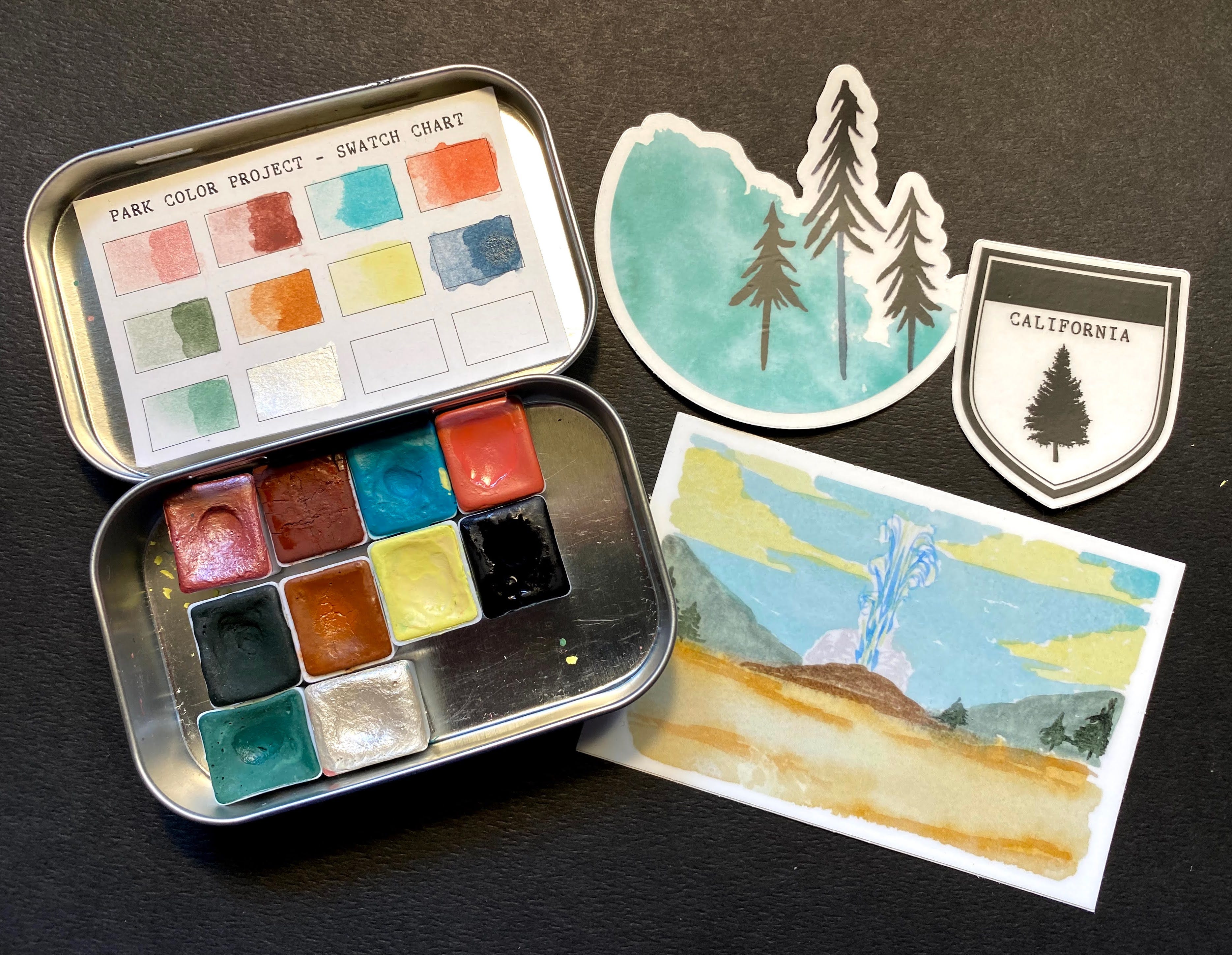
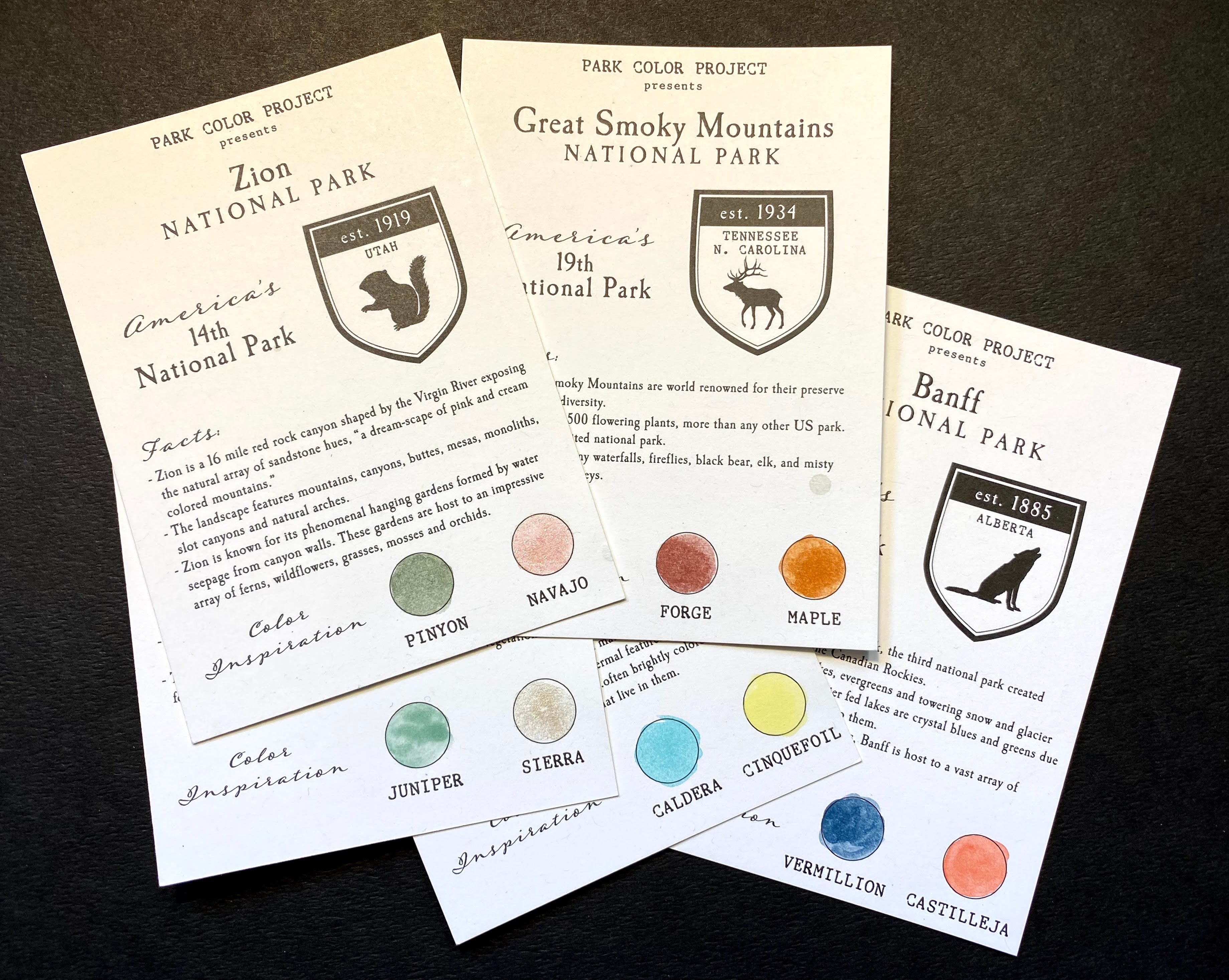
Here are the fact cards that come each month. Yosemite and Yellowstone are the partially hidden parks. I do love that Caldera color!
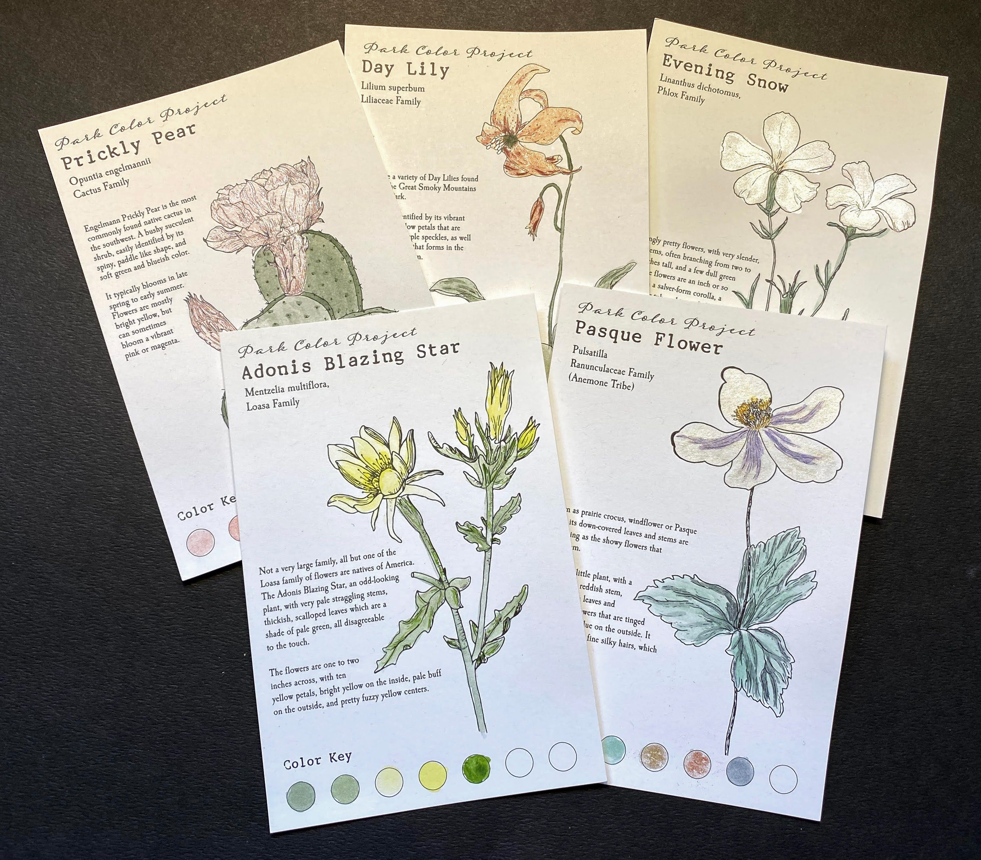
Finally, here are the postcards - each has a flower to paint. They’re laid out in the order they came - Zion, Great Smoky Mountain, Yosemite, Yellowstone, and Banff.
Perhaps I set my expectations too high. I expected that the paints that arrived each month would directly relate to the flowers on the postcards. I could stretch sometimes, but other times, not so much. Each month I looked at Google images for pictures of the featured flower, so I could try to paint it somewhat accurately. What I found is that often the description on the card doesn’t match up well with the majority of photos I see online. This is where the problems with accuracy start to show.
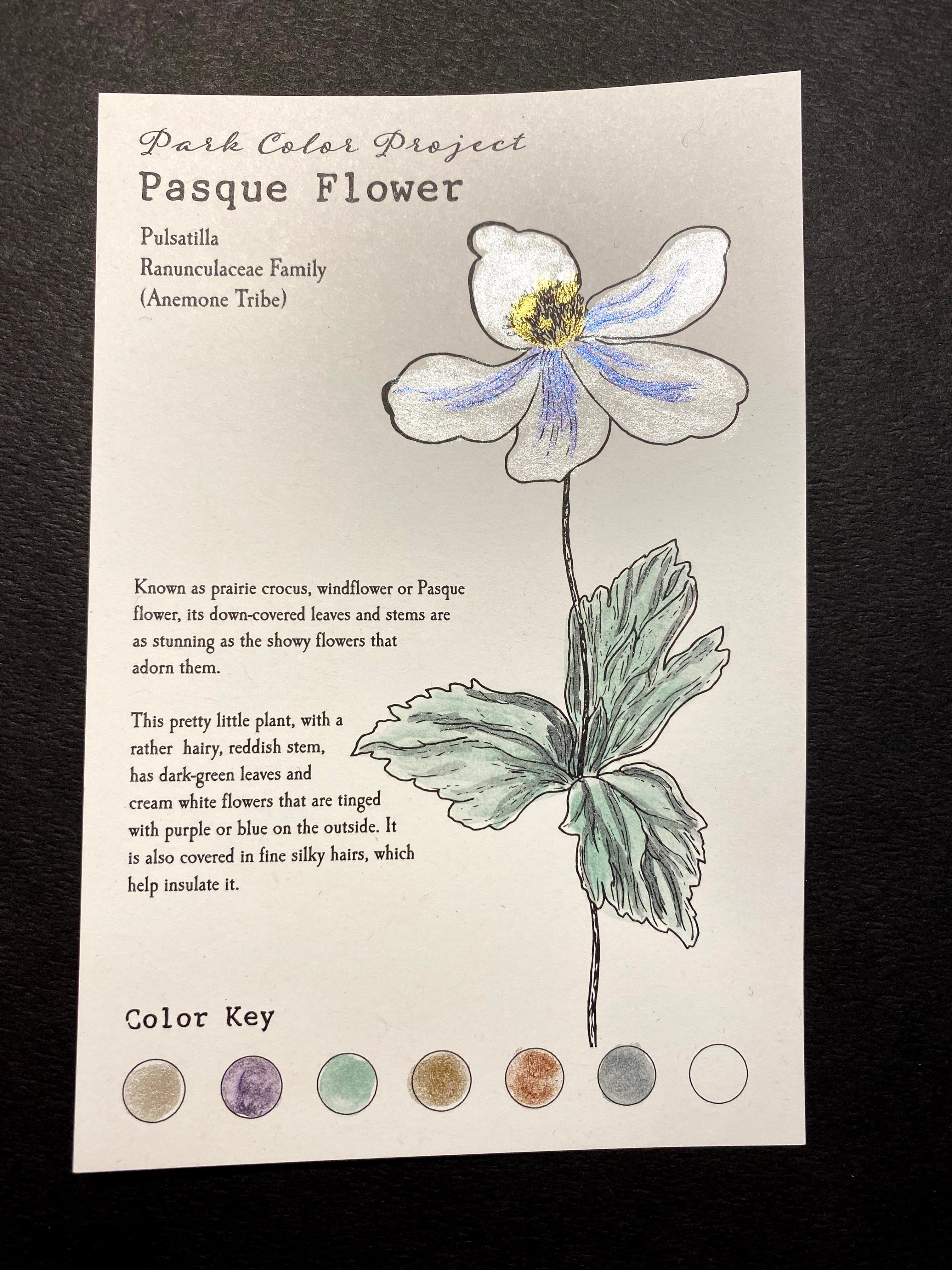
Let’s take the most recent - Pasque Flower, also known as Prairie Crocus or Windflower. Google images brings up mostly pictures of some lovely purple flowers, yet the description mentions they are creamy white with a purple tinge on the outside. Hmm…
Yesterday I was leafing through my tattered copy of Plants of the Pacific Northwest Coast and took a look for Pasque flower - what I found was the Western Pasqueflower (Pulsatilla occidentalis) and its description does match that on the card. Also called White Pasqueflower, this variety is found in Banff National Park, and in fact Pulsatilla Pass in the park is named for the flower (source). The Prairie Pasqueflower is also found in the park, and it’s a lovely lilac color and sometimes goes by the common name of Prairie Crocus.
I’m left wondering which flower they meant this to be - they aren’t the same thing! They’ve managed to mix two thing here - the common names for one variety and the description of another. They could have used the accurate White Pasqueflower and tied it to an interesting fact about the park!
I realized one of my biggest problems as I try to work this out today - they don’t cite any of their sources for the information they’re sharing. They include the National Park Adventure Guide Book in most of their photos related to this project. It’s a travel passport sort of guide - slap your sticker on the page when you’ve visited a park. The vintage park poster look makes for nice Instagram photos. I also see occasional books that look old in the photos - again, they’re photogenic but they might not be the best source for the facts that are shared.
Anyhow, here’s my sparkly version of the Prairie Western Crocuspasque Flower:
I could maybe overlook one error, but this sort of thing has happened multiple times!
Last month the flower featured for Yellowstone was the Adonis Blazing Star, aka Adonis Blazingstar (Mentzelia multiflora). It’s a flower of the Southwest, and according to observations on iNaturalist its range doesn’t come near Yellowstone. The Giant Blazingstar (Mentzelia laevicaulis) can be found in Yellowstone!
This is how misinformation spreads. This is also how my head blows up.
But wait - there’s one more thing. Thank you for sticking with me this far. The creator of this project recently posted the photo below, touting the newest set. I notice she didn’t stick with an accurate-to-description paint job either. It’s not much fun to paint white flowers on white paper anyhow.

A close-up view of how beautiful Vermillion (our flexible navy blue) and Castilleja (our opaque to sheer salmon pink) work with our existing Park Color Project watercolor paints.
Hello Banff National Park, the 5th stop on our watercolor tour. 🏔
Paint maker @the_jamie_gray and I spent weeks fine tuning each unique color selection to ensure they stand alone as well as ‘play nice’ with others.
In the most recent set they named a dark blue Vermillion.
Vermillion.
Type ‘vermillion’ into Google images and you will see a wall of this color:
That’s not blue, not even close. By now you can probably imagine that my need for accuracy is being pushed to the edge. It also seems like some incredible artistic faux pas is going on here.
I may have mentioned that “vermillion is red, not blue” in my cancellation notes. I got an almost immediate response explaining that the blue paint is named for the Vermilion Lakes in Banff, and their beautiful dark blue colors.
Why not say so? And of all the possible words in the world to choose for a blue paint they chose a word that unequivocally brings to mind a brilliant red color.
I tried to find some information on the naming history for the Vermilion Lakes, and couldn’t find anything. I did find something for Lake Vermilion in Minnesota however:
The Ojibwe originally called the lake Nee-Man-Nee, which means “the evening sun tinting the water a reddish color”.[1] French fur traders translated this to the Latin word Vermilion, which is a red pigment. (source)
I wonder.
The creators of this project are well-meaning, but in the end they’ve failed to reach a level of scientific accuracy that I believe something like this should have. Their product is being sold as a product representing factual information, yet I have no idea what their sources are or whether they’re reliable.
I appreciate you coming along for the ride while I worked through my issues with this subscription package. I’m feeling much better now and I’ll step down from my soapbox.
Nolan - if I got anything wrong with the botany, please correct me in the comments!
Speaking of comments - don’t be shy, say hi. Since I’m obsessed with colors today, tell me what your favorite is.
Have a great week!
Tidbits
World Nature Photography Awards - check out the 2020 winners
Make & Mend Secondhand Art and Craft Supplies - slightly used, easy on the budget, and the choices are always changing! (thanks J.P.!)
Consider the quasi-commune - Anne Helen Petersen
Sketchbook Revival - FREE online workshops from 28 artists begin on March 18th. Sign up to get two videos/day, which will be available through April 18th to watch at your convenience. There are some great artists in the lineup!
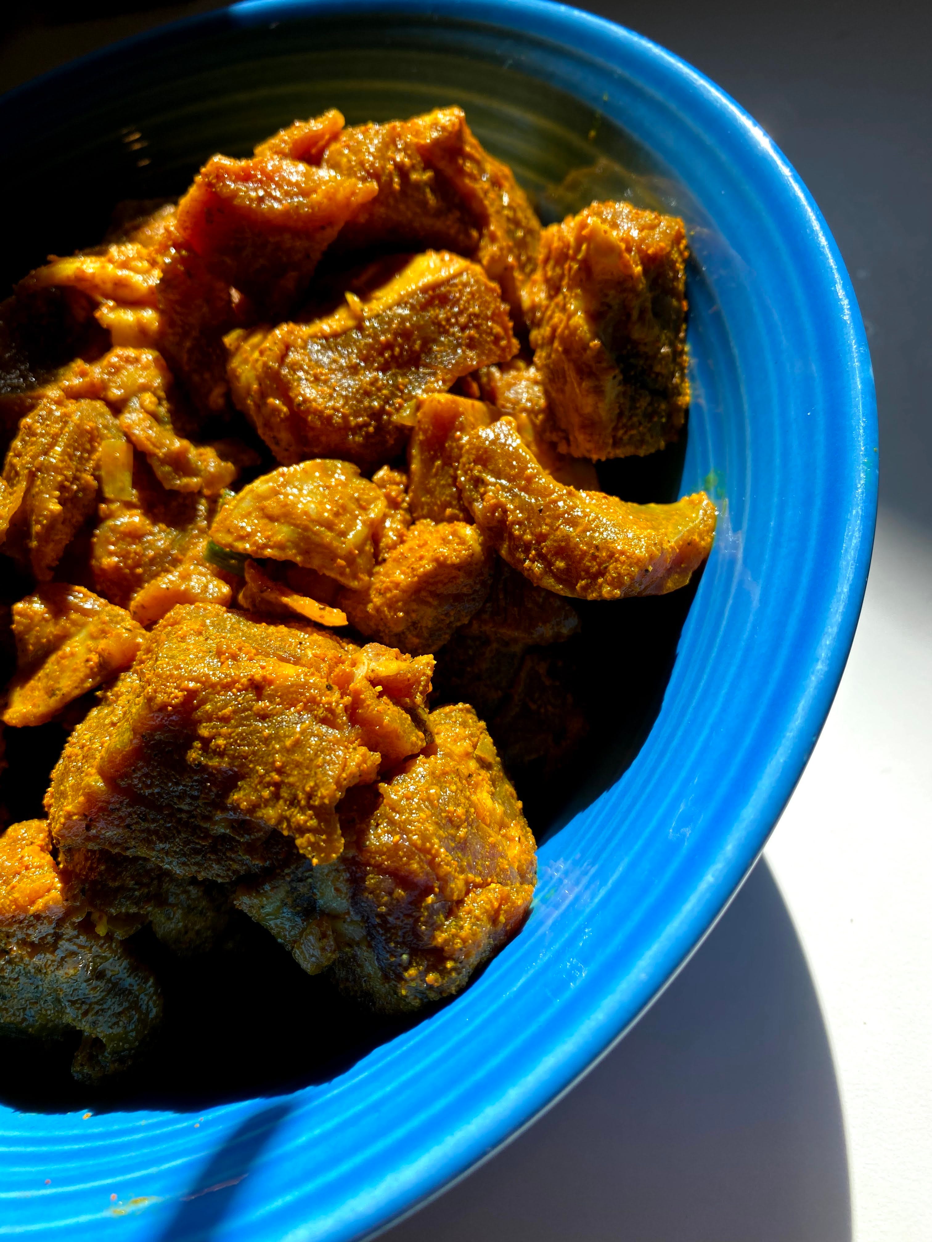
Recently eaten: Michael made some delicious Jamaican Curry (he used lamb instead of goat). It was hard to stop eating! Here’s the meat right after the marinade step - so colorful! I’ve got leftovers for lunch tomorrow. YUM.
Making: more of the little pods - almost halfway through! They’re a great way to relax at the end of every day. That’s next up after I finish this so I can relax after my rant.
Reading: I started reading Behold the Dreamers by Imbolo Mbue, who it’s looking like we’ll be hosting at the library for a virtual event soon! Otherwise poking at a few things but not really serious about any of them.
Art Zone
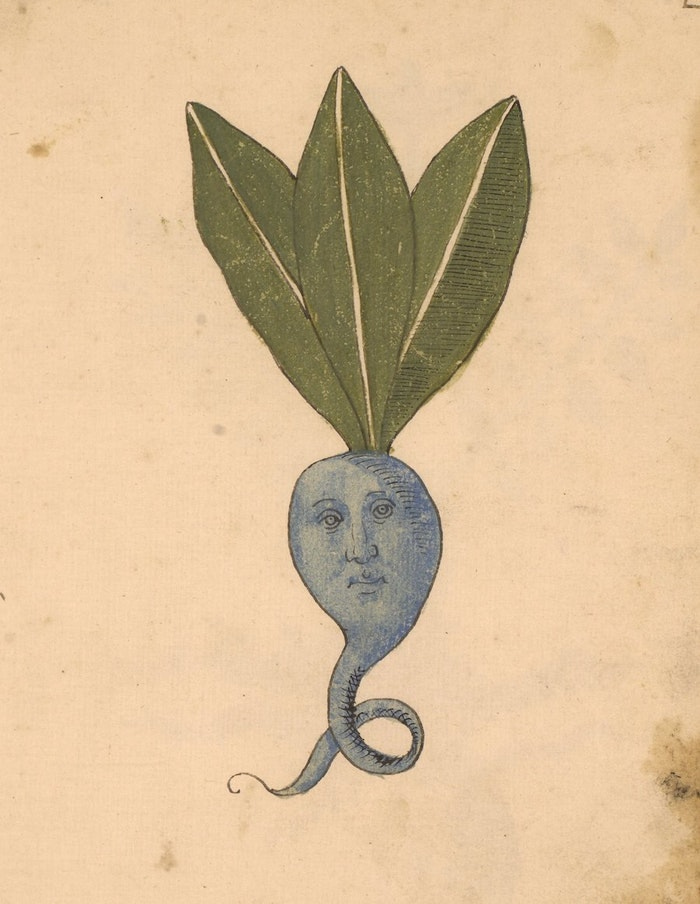
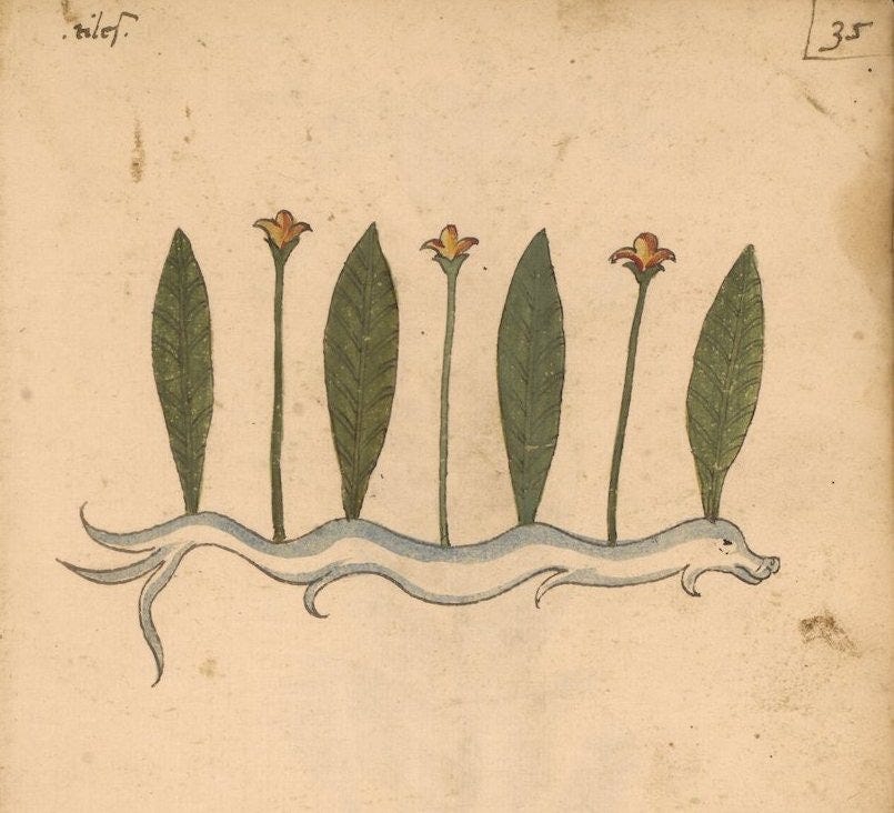
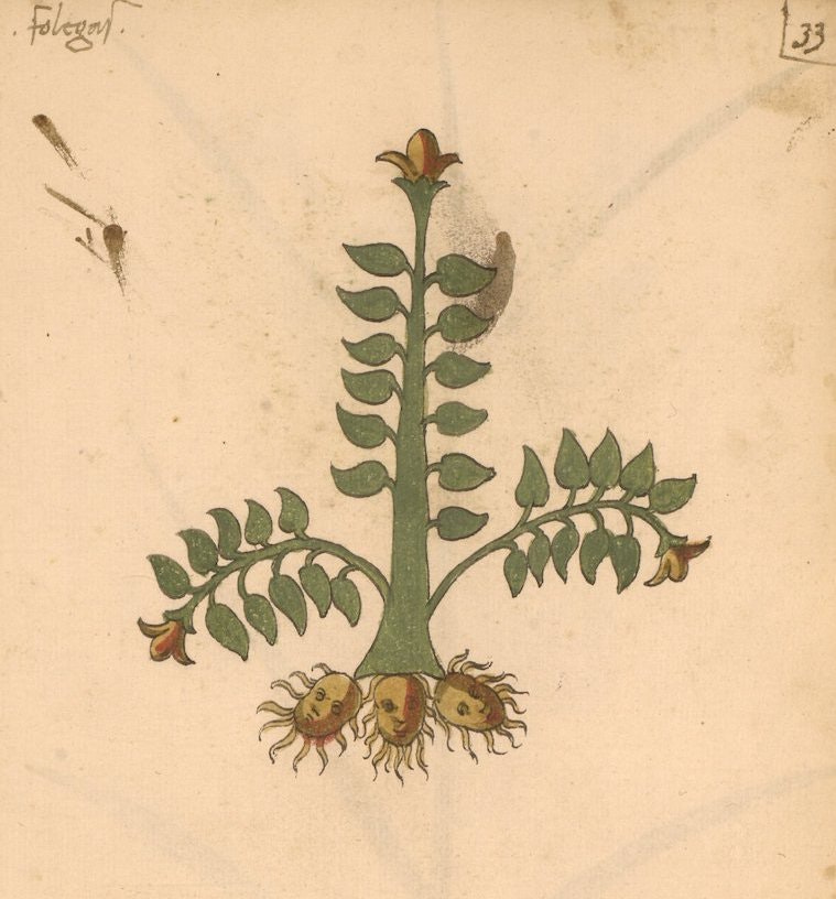
Erbario: a 15th-century Herbal from Northern Italy
If you’re not going to be accurate, go all out.
It’s the original set — with its anthropomorphised vegetation and dragon-shaped roots — which we’ve been mostly drawn to in our highlights below, but you can have a look at the original on the Penn Libraries site (Ms. LJS 419) to get a sense of the full range of interleaved styles in this remarkable manuscript.
.
.
.
.
Video of the Week
Oh hey - Fontaines D.C. were nominated for a Grammy for Best Rock Album.
Current Temperature: 40.5 F (4.7 C)
Current Humidity: 99%
Wind (max gust): 15.9 mph
Precipitation: 0.37 inches
My favorite color is black. Fascinating journey here Anne. I’ve always had issues with color swatch “names”. “Aqua Marine Sunrise” sounds like a an opinion and a cocktail and does nothing for me in defining a hue. Nothing. Add to that 12 more colors with similar names and I give up.
re: that 15th C botany book . . . As the anthropomorphized roots were drawn with increasing malevolence, I became convinced the artist(s) of that 15th C herb book were gardeners . . . or at the very least had to pull weeds at the monastery for penance . . . Wow, that was a fascinating find, Anne!